
The Reading
The market has been in Capitulation since 2026-05-29, the most extreme of the six regimes defined by our valuation framework. Every recorded cycle low has formed within this regime.
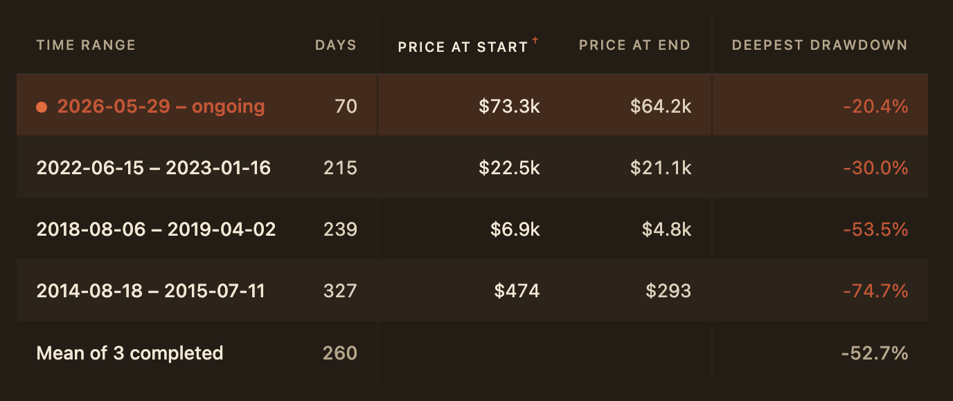
Relative to prior capitulations, the current episode has remained young and shallow. At 70 days, it’s a fraction of the typical 260-day span. Its deepest drawdown so far is 20.4%, well below the 52.7% average maximum decline recorded across previous episodes.
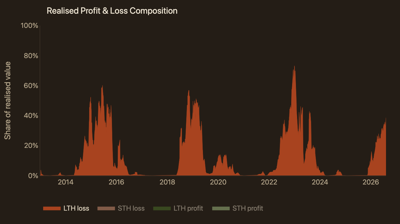
Long-term holders realising losses now account for 38.6% of total realised value, up from 27.8% at the onset of the regime. They have been the leading source of sell-side activity since late July.
Among those sellers, investors who bought within the most expensive 15% of the cycle’s advance hold the largest volume of trapped supply on record, which peaked at 2.03M BTC. They have since distributed 19.4% of that supply. By comparison, the equivalent cohorts in the previous two bear markets had distributed 25.3% and 22.0%, respectively, by the time price reached its low.
That particular cohort’s grip on the sell side is easing, but remains substantial. It still accounts for 19.6% of all loss-selling by long-term holders, well above the 2.6% and 7.9% seen at the previous two lows. Its spending rate has fallen 47.5% from peak, a smaller decline than the 81.1% and 84.5% the prior two cycles recorded by the time the next cycle topped.
Alongside the framework itself, it’s important to monitor the behaviour of long-term holders selling at a loss, and top buyers in particular. Any transition back toward a bull market would require a further easing of their sell pressure.
The Recap
This section revisits the context established in earlier editions that is relevant today.
Naming the Regime
Our first edition, Time, Not Price, set out to build a structured answer to the question this market asks most often and answers least consistently, where are we in the cycle. The result was a valuation regime detection framework, which reads market position from on-chain cost basis rather than from the shape of the price chart. This edition picks up that thread. It studies how the market behaved through comparable regimes in the past and treats that record as a compass, both for how far the current episode might stretch and for what an early transition out of it would look like.
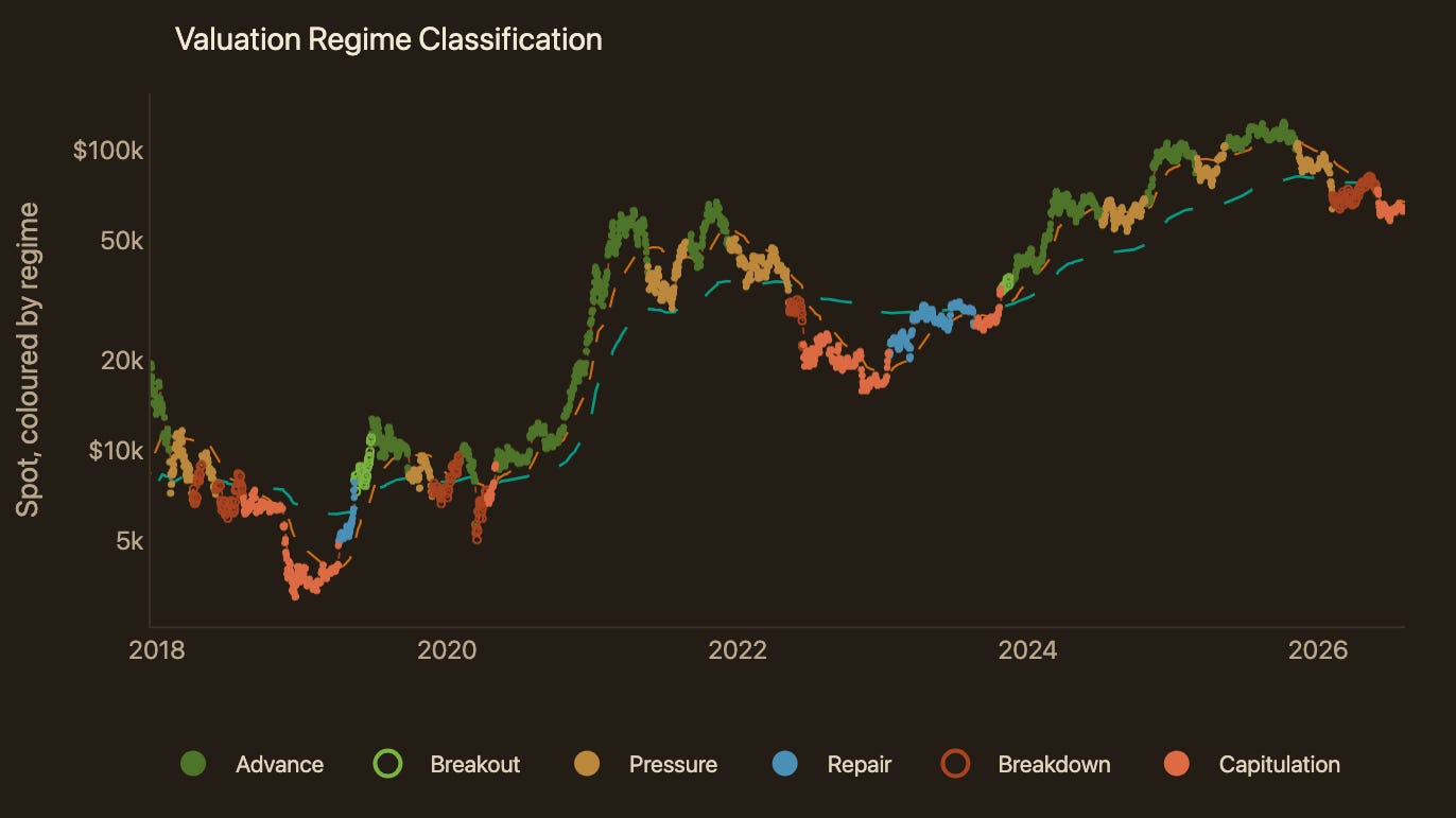
As shown in Figure 1, the market has held Capitulation since 2026-05-29. The classification rests on three cost basis models, each describing what a different part of the market paid for its coins.
1d–1w cost basis at $63.5k. The average price paid by the newest capital in the market, covering coins acquired within the past week.
Short-Term Holder cost basis at $67.4k. The average price paid across coins held for less than 155 days, the cohort most reactive to recent price action.
True Market Mean at $75.8k. The aggregate cost basis of actively circulating supply, excluding long-dormant coins such as lost supply and Satoshi-era holdings.
Capitulation is the weakest of the six possible orderings, and it is the one in force when the newest cost basis sits below the Short-Term Holder cost basis, which in turn sits below the True Market Mean. Money entering the market today is paying less than almost everyone it buys from.
That discount is what gives the regime its significance. Every completed cycle low in this record formed inside it. The three prior lows, January 2015, December 2018 and November 2022, each fell within a Capitulation episode rather than before or after one.
The reason sits in who ends up holding the coins. Supply changing hands here passes to buyers whose cost basis is well below that of recent buyers and below the active market as a whole. Coins bought at that discount tend to settle with investors carrying stronger conviction and less reason to sell into further weakness, so the sellers capitulating today are handing supply to a cohort less likely to return it quickly. That is precedent rather than prediction, and it does not mean a low is forming now. What the sections that follow measure is whether the selling that defines the regime is still running.
The framework earns its keep at the other end of the regime. Having run this long, the question worth tracking is no longer where the market sits but what an exit would look like, and here the framework offers a threshold rather than a guess. As a working rule, the first credible sign of a shift into Repair is price holding above the Short-Term Holder cost basis on a weekly basis rather than in a single session. In the framework's terms that means the 1d–1w cost basis reaching the Short-Term Holder cost basis plus its deadband of 6.8 percentage points, which currently places the level near $72.2k. Anything short of that is movement within the regime rather than an exit from it.
Measuring the Distance
Assigning a regime to a single day is only part of what the framework can do. Plotting how far apart those three cost bases sit, day after day, turns that single reading into a path. The path shows how far through a cycle the market has come, not only where it stands today. Two deviations carry it. Depth is the gap between the 1d–1w cost basis and the True Market Mean. Spread is the gap between the Short-Term Holder cost basis and the same anchor. Both are natural log ratios, and the functions below transfer the pair onto circular coordinates, condensing them into a single distance and bearing.

As shown in Figure 2, Depth currently reads -17.75% and Spread -11.77%. Together they have carried this episode 27% from the centre at its furthest so far, the distance r above, which serves as a measure of intensity, with the bearing still pointing into the Capitulation wedge rather than toward Repair. Set against the average path traced through the last 3 capitulations, all of which ended by turning into Repair, this one has run 70 days where those averaged 260, and it has yet to approach the peak intensity of 76% reached along that path. On both coordinates the episode remains shorter and shallower than its historical analogues.
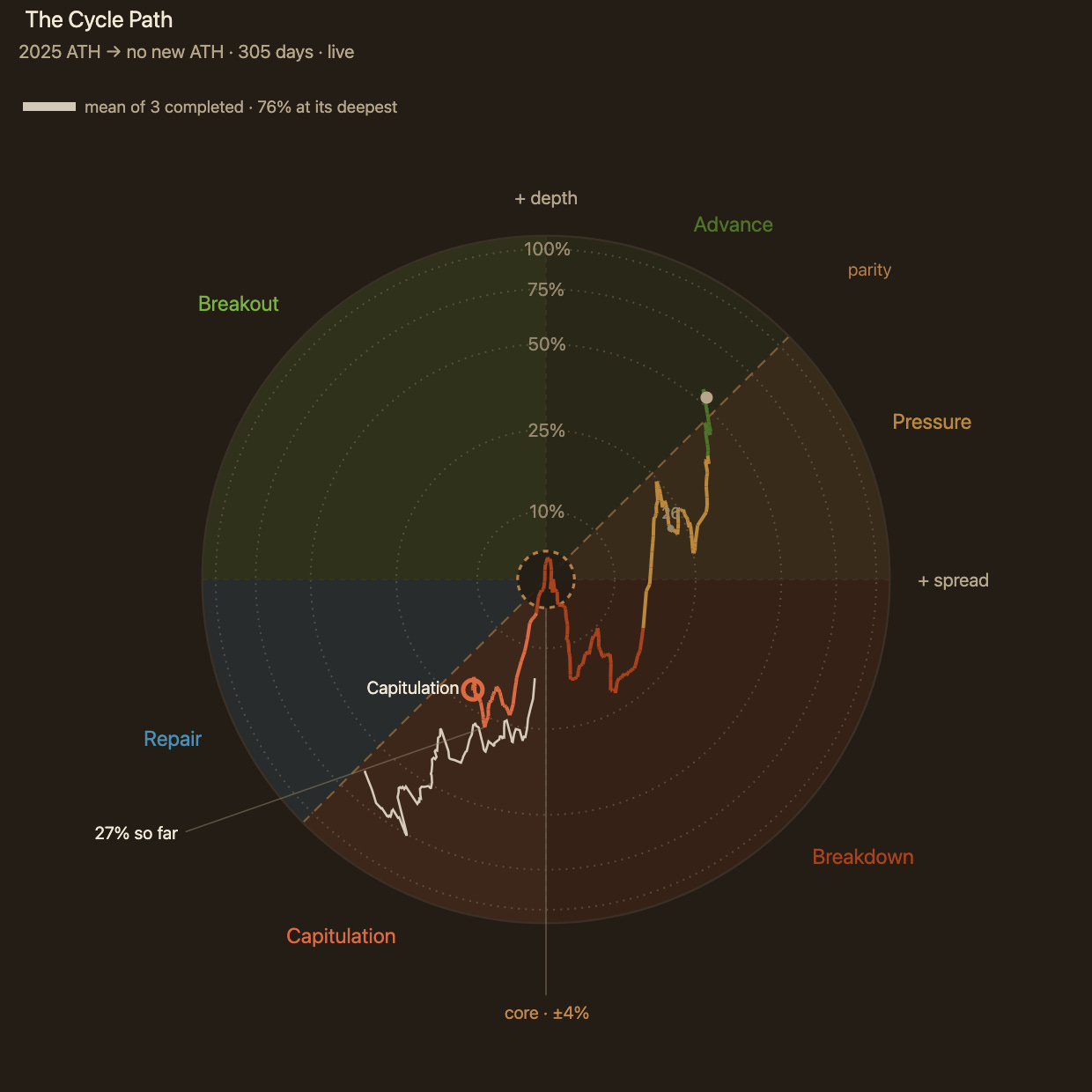
Assuming the market begins to expand from here, the framework sets two levels that would confirm the turn, and both are a cost basis raised by its deadband, the margin a crossing has to clear before it counts as a regime change rather than noise.
Repair takes the Short-Term Holder cost basis as its anchor, which places the level at $72.2k, some 13.6% above the 1d–1w cost basis today. A full rotation onto the bull side takes the True Market Mean, at $81.3k, which is 28.1% above that same basis rather than a further step beyond Repair. In each case spot has to hold above the level for a week rather than simply touch it, since that is the window across which the 1d–1w cohort reprices.
Every episode on record
Counting the Damage
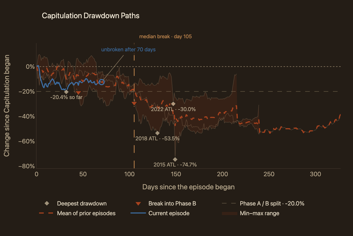
The disc above took Spread and Depth as two coordinates and transformed them into a distance and an angle. That plots the market’s path through the cycle, which can then be set against earlier ones. The same comparison can be made a simpler way, in price alone. Figure 3 rebases every capitulation to day one of its confirmed start and carries it through to the day that regime turned decisively into Repair, which puts bears of very different length on a common footing. Read that way, the question is no longer where the market sits in the cycle but how much of the repricing each episode had done by a comparable point.
Spot currently sits -12.5% against the price at which the market entered the regime, and at its deepest it traded no worse than -20.4%. Both readings keep the episode inside Phase A. The boundary into Phase B asks for a close 20% below entry held for three days, and this episode has touched that level without holding it. A single close through the line is exactly what the three-day rule exists to filter out.
The three completed episodes crossed that boundary on days 45, 105 and 147. At 70 days this one has already outlasted the earliest of them without breaking, though it sits well short of the other two. Should the break come, it would carry the market into the stretch where those episodes did their deepest repricing. That makes it a condition to watch rather than an outcome to expect.
Finding the Sellers
Taken together, these readings place the market in the first half of a conventional capitulation. What they do not say is which cohort is exerting the sell-side pressure that sustains the regime.
Figure 4 splits total realised value into four bands, separating profit from loss across both long-term and short-term holders, so the reading describes composition rather than absolute size. Long-term holders realising losses now account for 38.6% of all realised value, up from 27.8% on the day the current regime began, and the largest of the four bands since 24 July. Before that date, short-term holders were booking more loss than any other group. The two loss bands combined represent 62.4%.
That leaves long-term holders in loss as the dominant force on the sell side. Whether this capitulation eases from here or intensifies rests largely with them. Any move into Repair has to face the persistent distribution from the seasoned investors in loss. The trajectory of that share carries more information than its level, since it tracks how worn down the cohort has become rather than where price is trading, and that wearing down has now had 70 days to run.
The Trapped Crowd
Sizing the Surrender
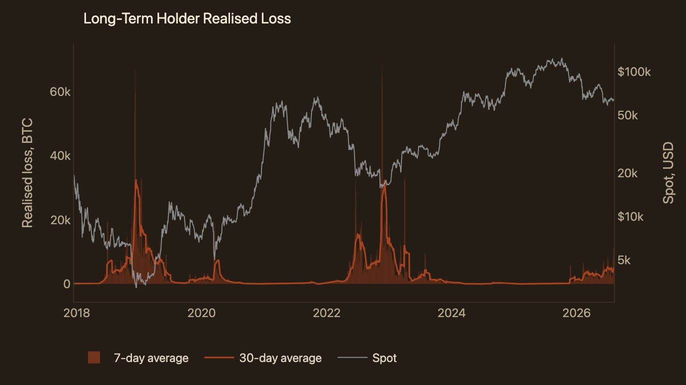
The previous section described that selling as a share of realised value. A share identifies the dominant seller, but it does not quantify the intensity of sell pressure. Sizing that pressure requires absolute volume, and Figure 5 measures it in BTC rather than USD, which allows the current pace to be gauged against comparable intervals in recent cycles.
The 7-day average of long-term holder realised loss has reached 9.3k BTC a day, more than double the 30-day average of 5.1k BTC a day. A short-window average running well above its longer-window counterpart is the signature of acceleration in this series. Measured against December, when the same 30-day gauge ran between 1.2k and 2.3k BTC a day, the current reading is 3.1 times that month’s average. Nothing in the absolute volume points to a cool-down yet. While long-term holder loss realisation keeps running this hot, a transition into Repair, let alone a turn onto the bull side, remains difficult to build a case for.
Who Bought the Top
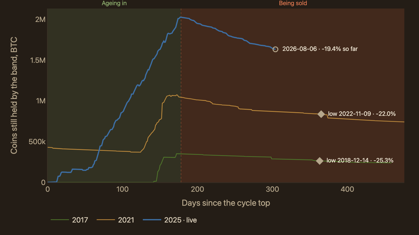
A rising share of realised value and a rising volume of coins, both coming from long-term holders selling at a loss, is the dynamic that sets how long this capitulation runs. The long-term holder label, however, captures every coin held for more than 155 days. That is most of the circulating supply, far too broad a group to act on. In reality the stress is concentrated among investors who bought closest to the cycle top. To zoom in on those trapped investors specifically, Figure 6 isolates supply whose cost basis sits within the most expensive 15% of the cycle’s climb, drawn across the last three bear markets.
The supply held by this cohort follows the same two-phase shape in every cycle. In the first phase it expands, as coins bought within the band keep crossing the 155-day threshold and maturing into the cohort faster than holders spend them. That growth runs out roughly six months after the cycle top, and notably it has done so at almost the same point in all three bears measured here. In the second phase the trapped supply begins to decline, rapidly at first and more gradually as the bear extends. Nothing is left to mature in by then, so every step down is that cohort distributing, and the steepest part of the fall is its heaviest selling.
This cycle has trapped more supply than either of the two prior cycles measured here, with each read at its own peak, the point at which the coins bought inside the band have matured into the long-term holder cohort. That figure reached 2.03M BTC this cycle against 0.35M BTC and 1.07M BTC previously. Since then it has distributed 19.4%, where the previous two cycles had shed 25.3% and 22.0% by the day their respective bears bottomed. On that comparison, a considerable portion of this cohort has yet to sell.
Their Grip on the Sell Side
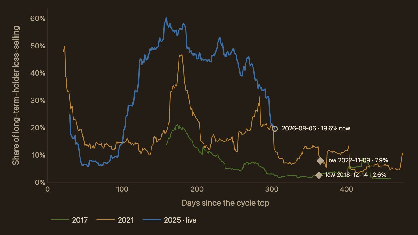
Measuring the trapped supply’s size says how many of this cohort’s coins are still waiting to move. It does not say how much of the actual loss-selling they account for. Figure 7 sets the loss realised by the top 15% band against the loss realised by all long-term holders. That tests whether the coins these investors distribute are the ones anchoring price and stretching the bear out.
Peak concentration has risen with every cycle, from 21.1% in the 2017 bear to 49.9% in 2021 and 60.5% now. That progression tracks the lengthening of each top formation as the market matured, since a longer stay inside the band leaves more supply parked at the dearest part of the climb. The share then erodes as the bear progresses, and in both completed cycles it had declined into single digits by the day price bottomed, at 2.6% and 7.9%.
The reading currently stands at 19.6%, well down from its 60.5% peak but still multiples of what either completed bear registered at its low. Alongside the sheer size of the trapped supply, the second condition that has to ease is this cohort’s grip on the sell side. In both completed cycles that grip relaxed into single digits before the bear concluded.
How Fast They Let Go
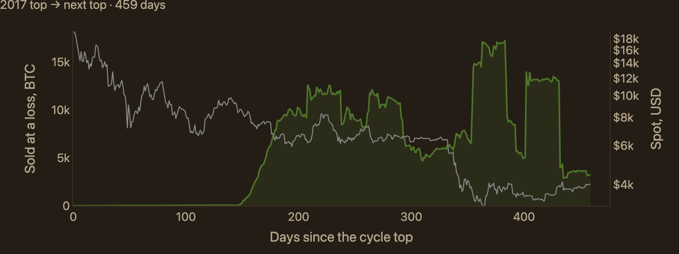
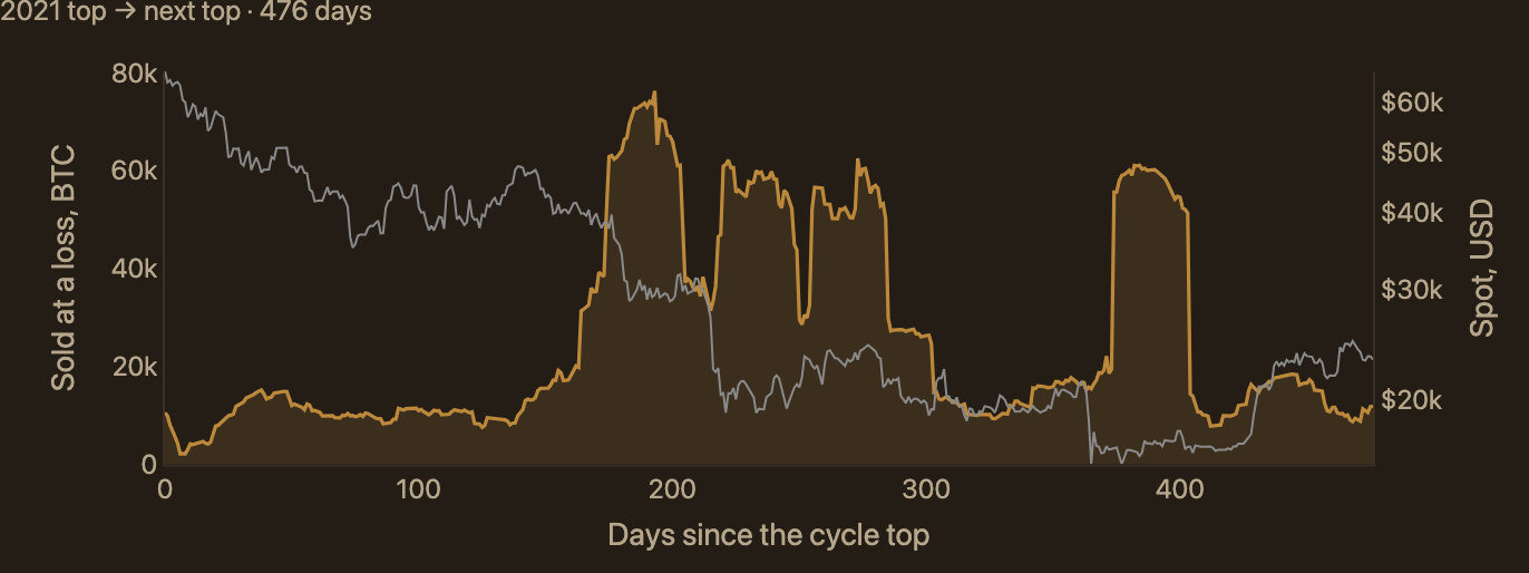
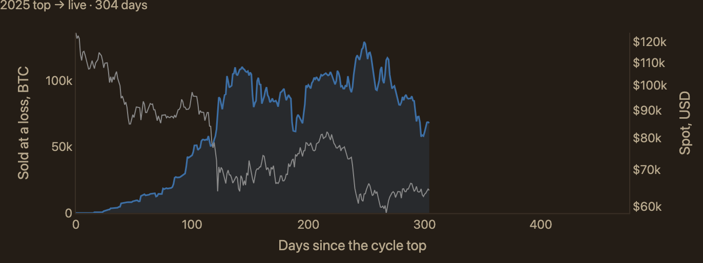
Between the size of the band and its hold on the sell side, this one cohort accounts for much of what the market has to absorb before the regime can turn. How quickly it is letting go is therefore the more practical thing to track, and Figure 8 reads the same selling as a rate rather than a share. The band is currently spending 67.8k BTC a month, down 47.5% from a peak of 129.1k BTC recorded on 11 June. That decline is genuine, but it is not the order of cool-down that has accompanied the end of a bear. Both completed cycles saw this measure fall by 81.1% and 84.5% from their own peaks before the following cycle topped.
Field Notes
An occasional slot for events that leave a footprint on the indicators this report reads without moving price directly. What this section covers mattered in the week of publication and may not matter later, so read it as a record of that week rather than a standing part of the method.
The main lesson of the sections above is that the shape of this cycle’s low rests mostly on the pace at which long-term holders realise losses. That makes it worth checking whether those loss readings are the market itself or an artefact of something else, and late July supplied a candidate.
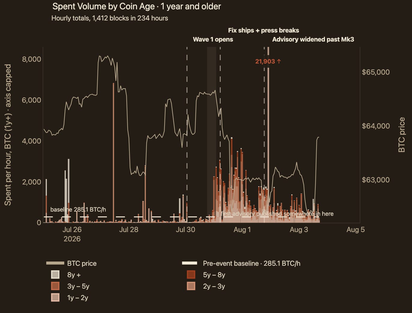
A hardware wallet firmware flaw disclosed on 30 July rendered a population of seeds reproducible, and draining of affected wallets began the same day. The theft itself was small and is not the finding. What matters is that the disclosure mobilised coins that had been dormant for years, so the question is whether that reshuffling has skewed the elevated loss realisation this report has attributed to long-term holders.
The reaction is visible, and it is dated to the disclosure rather than the theft. Spending by coins aged one year or more ran at 0.6× the prior five-day baseline on 30 July, quieter than an ordinary session. It reached 7.4× baseline the following day, once the fix shipped and the story circulated, then decayed over the three days after. Holders were moving coins to new seeds, not selling them.
Almost none of that volume can reach the loss series. 114k BTC of year-plus coins moved after the disclosure, net of a single custody rotation the artifact flags as unrelated, and 66% of it came from coins two years or older. Those were overwhelmingly acquired below today’s price, so they left as profit and never touched the loss-selling the sections above read. The one-to-two year band cannot be separated the same way, since these are age bands rather than cost-basis bands, but it is the minority of the flow. The capitulation intensity described earlier stands on its own.
Final Thought
Our in-house valuation framework places the market in Capitulation, the regime under which every completed cycle has bottomed. Relative to previous capitulations, the current episode remains young and shallow. It has yet to reach its extreme, placing it within the initial phase of a conventional capitulation.
Long-term holders selling at a loss now dominate the sell side. Among them, investors who bought closest to the top hold the largest trapped supply on record.
That cohort’s dominance of the sell side has eased substantially from its peak but remains well above levels recorded at the previous two bear-market lows. Its spending volume has also declined far less than it did during those two earlier cycles.
The central conclusion is that this capitulation has not yet cleared the overhang to the extent typically seen prior to a recovery. Historically, that point has been reached only after a final wave of loss realisation among investors who bought near the top. Without a confirmed break above the Short-Term Holder cost basis, it remains too early to picture an end to the regime. Long-term holder loss realisation must first cease expanding. For now, that condition remains unmet.
Data Source: bitview.space · Bitcoin Research Kit
The comparison to the previous lows is very useful context! It helps put everything into perspective instead of just reacting to the day-to-day price action. You put it in a way that would help make buyers less nervous long term. Curious to see how the LTH spending rate evolves from here.